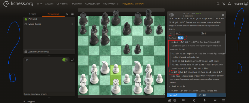
During the analysis, the tree of options looks terrible: the main line of the option goes, then the moment comes when alternative moves appear after which the moves along the main branch look like subvariants. It is impossible to visually understand this. The continuation of the main option should go from the left edge, and not be shifted to the right, like the alternatives before it.
Why is there so much empty space on the sides? Instead of stretching the analysis window, you force yourself to dig into this small window.
Who is the designer? Who is this dilettante?

This is the way Lichess draws the movelist. They've tried small changes in the past but mostly abandoned them after user feedback.
You could try enabling "disclosure buttons" in the hamburger menu, but it's likely you'll find that rendering option even more distasteful.
This is the way Lichess draws the movelist. They've tried small changes in the past but mostly abandoned them after user feedback.
You could try enabling "disclosure buttons" in the hamburger menu, but it's likely you'll find that rendering option even more distasteful.
"Disgusting design" and "dilettante" are quite strong words...
Not sure what you exactly mean with the scoresheet. Maybe just show this in a less blurred screenshot, and about showing a better way to do it?
Maybe you can also play with CSS in your browser to get a better result for the borders... Note that going 100% width is often not a good choice, especially on wide screens.
If you install the LiChess Tools browser extension you can get a lot of features including the possibility to expand the move list in the available space, @Polypoid
If you install the LiChess Tools browser extension you can get a lot of features including the possibility to expand the move list in the available space, @Polypoid
@gamblej said in #2:
disclosure
What does disclosure buttons option do?
@gamblej said in #2:
> disclosure
What does `disclosure buttons` option do?
And so... it begins...
@aljustiet said in #5:
disclosure
What disclosure buttons option do?
please man... dont do this
@aljustiet said in #5:
> > disclosure
>
> What `disclosure buttons` option do?
please man... dont do this
@chesspanda6 said in #7:
disclosure
What disclosure buttons option do?
please man... dont do this
Was I wrong? Why was I wrong?
@chesspanda6 said in #7:
> > > disclosure
> >
> > What `disclosure buttons` option do?
>
> please man... dont do this
Was I wrong? Why was I wrong?
@TotalNoob69 said in #6:
And so... it begins...
What begins?
@TotalNoob69 said in #6:
> And so... it begins...
What begins?
nothing is wrong... its just that... a random thread of endless questions starts
nothing is wrong... its just that... a random thread of endless questions starts


